Branding your therapy practice: 6 color palettes to consider
Are you a therapist, psychologist, or counselor in the process of choosing a color palette to brand your private practice? If so, sifting through an endless array of combinations has likely left you feeling overwhelmed with option fatigue. Here at Tiffany Kenyon Design (TKD), we’ve handpicked five color palette options to consider for your brand.
Keep in mind that the perfect color palette for your private practice must resonate with your ideal clientele. It’s important to know who they are, how you want them to feel, and what you want to communicate to them. It’s also crucial to establish your mission and differentiate your brand from the competitors.
If you would like to work with an experienced brand designer to develop your logo and overall visual identity, click here to learn more about the branding services TKD offers.
Let’s dive in!
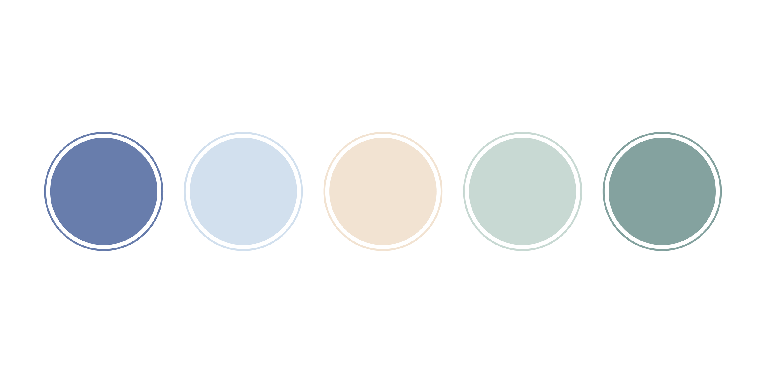
Soothing and grounded
It’s no secret that soothing blues and grounded greens are highly favored colors for private practices. Color palettes that draw from nature are inherently calming and this is often the mood a therapist strives to create in their office. For a similar color palette, check out the brand identity we created for Sean Maness.
client spotlight: Maness Hypnosis
Sean Maness is a hypnotherapist based in Dallas, Texas.
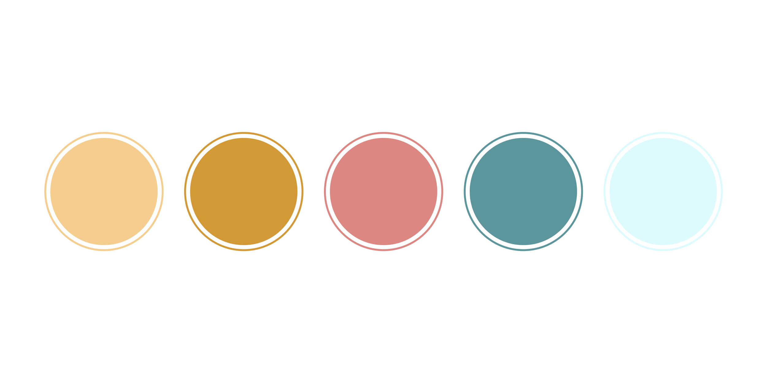
Youthful energy guided the inspiration behind this playful and soft color scheme. It’s appropriate for a children’s therapy practice looking for a color palette with invigorating and refreshing elements. Sunshine Daily Rx uses a similar color palette that is warm and inviting.
client spotlight: Sunshine Daily Rx
Helmed by Natalie Davila, Sunshine Daily Rx is a California-based marriage and family therapy corporation.
Teal is a mix of blue and green that promotes mental clarity and open dialogue. Purple works harmoniously with teal to foster awareness, insight, and calm. This is suitable for trauma therapists helping patients work through the physical, emotional, and psychological effects. For more color palette inspiration, check out Therapy Villa.
client spotlight: Melanie Perron
The abstract icon symbolizes how healing starts by recognizing the layers of a person’s mind that need to be peeled back to get to the root of an issue.
Your therapy practice’s brand should feel as professional, welcoming, and trustworthy as the care you provide. At TKD, we specialize in creating sophisticated, high-end branding for therapists who want to attract their ideal clients and elevate their practice.
Want a refined, strategy-backed brand identity?
This color palette is ideal for an art therapy practice whose clientele spans many age groups including children and adults. Art therapy promotes mental wellness through creative endeavors and the color palette reflects this while also remaining professional. It’s vibrant enough to convey creativity and serious enough to appeal to professionals.
This color palette strikes the perfect balance between earthy and polished. Complimentary purples and greens are perfect for therapy offices looking for a natural color palette that has an air of refinement. Laura Fish Consulting also implemented a color palette that draws from nature, check it out here.
This color palette is perfect for therapists aiming to deliver a sense of optimism and hope. The grounding greens offer energy and optimism, the bright yellow provides hope and happiness, and the lavender ties it all together with its relaxing properties.
Ready to elevate your private practice?
Tell me more about your practice in the form below!
More color palette inspiration
TK DESIGN has worked with many mental health professionals to develop strategic color palettes for their private practice. You’re welcome to browse through previous branding projects below.
Niyati Gandhi, founder of Therapy Villa, is registered with the College of Psychologists of Ontario. She supports adults and couples living in their journey to heal from the long-term effects of trauma and mood and anxiety disorders. VIEW PROJECT
Laura Fish is a marriage & family therapist as well as an educational consultant. Her San Diego-based consulting business, Laura Fish Consulting, promotes mental health through the integration of the brain, mind and relationships. VIEW PROJECT
Melanie Perron Counselling is a Canada-based counselling practice. VIEW PROJECT
Helmed by Natalie Davila, Sunshine Daily Rx is a California-based marriage and family therapy corporation. VIEW PROJECT


