4 creative logos with hidden messages
Logos with hidden meanings often bring a smile to our face that builds admiration for a brand. It’s especially appreciated when your ideal client uses your product or service and has an “aha moment” noticing the cleverness of your logo. In this post, we’ll take a look at four brilliant logos with hidden messages.
1. Toyota
Toyota’s logo combines three ellipses cleverly spelling out the company name. In a 1989 Toyota press release announcing the unveiling of this logo, they explain the meaning behind the ellipses.
“In geometrical terms, an ellipse contains two central points. One of these points represents the heart of our customers and the other the heart of our product. The ellipse thus symbolically unifies the two hearts.”
Toyota logo
2. Amazon
Amazon’s logo shows a smile connecting the letters A and Z communicating that you can find everything from A-Z on Amazon’s website. Turner Duckworth, a brand identity firm, designed the logo in 1999 and Jeff Bezos reportedly loved it so much he said “Anyone who doesn’t like this logo won’t like puppies.”
Amazon logo
3. BMW
BMW’s logo features Bavaria’s state colors, a nod to its home state in southern Germany. The blue and white quarters are often thought to resemble propellers, a myth BMW is correcting on its website here.
BMW logo
Flag of Bavaria
4. FedEx
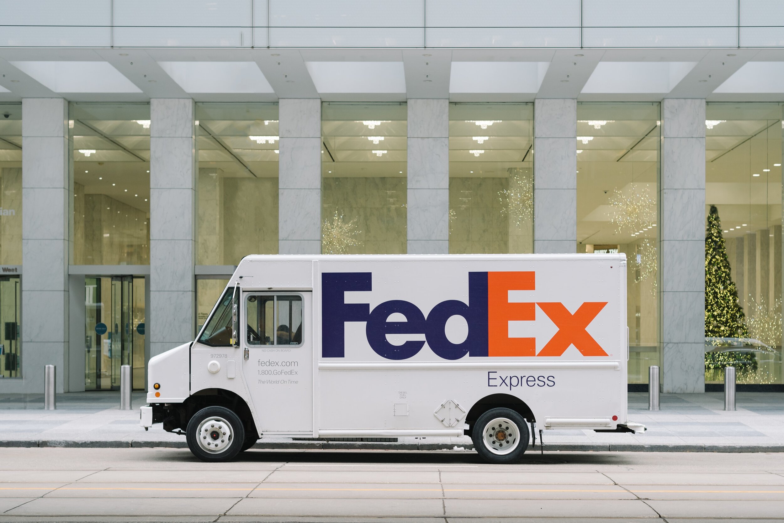
The FedEx logo was designed in 1994 by Landor Associates and has since won 40+ awards for its ingenuity. For this reason, you might already know about the hidden arrow in the negative space between the E and X. For those of you who are seeing it for the first time, you’ll never be able to unsee it.
FedEx logo
Hidden arrow highlighted above
Interested in a logo that has a hidden message? Let’s chat about your business!


